Frontend Mentor
by Alex Roan on 17 Nov 2024
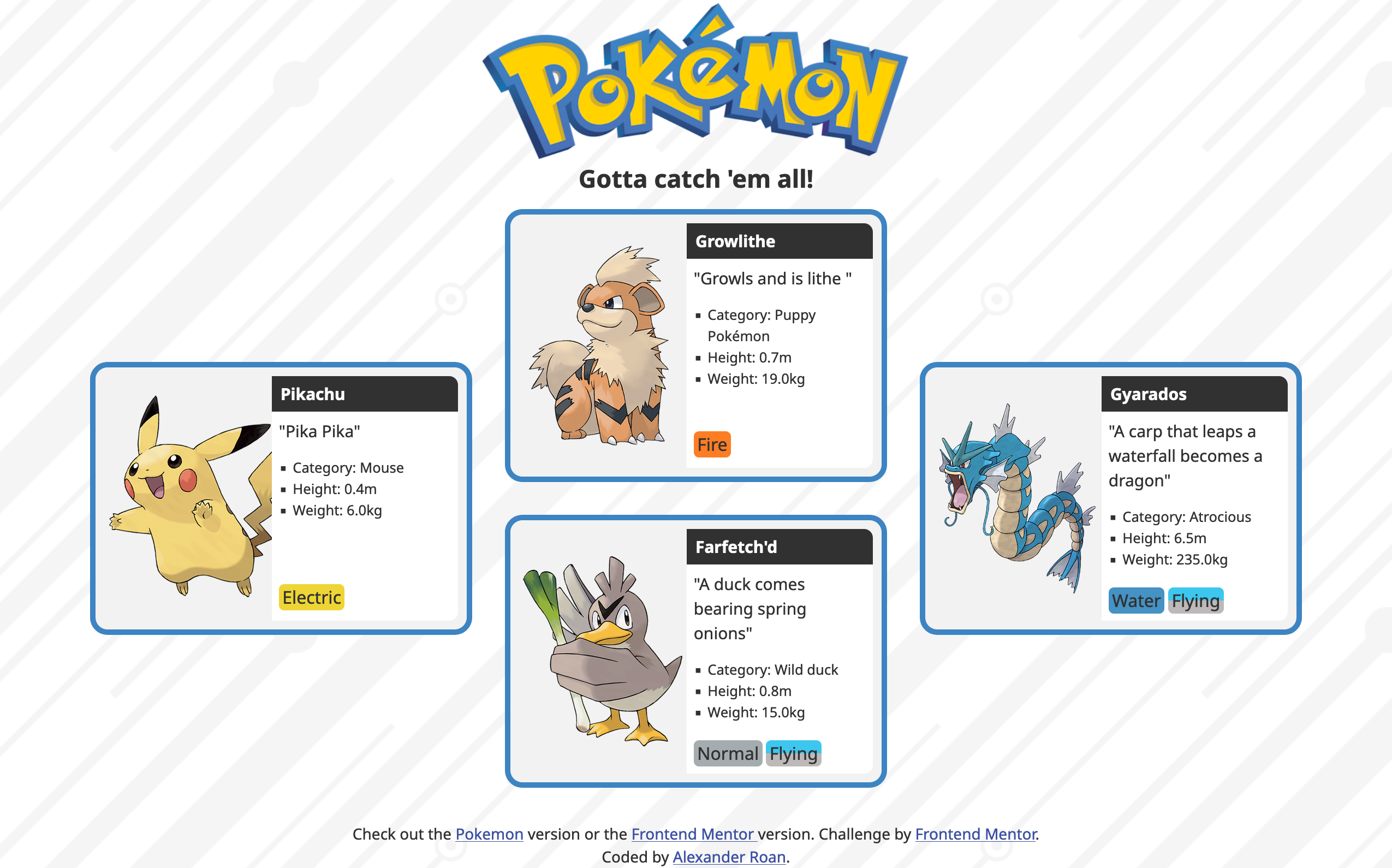
One of the challenges at FrontendMentor.com is to create a four card layout. One of the purposes of the exercise is to use CSS grid. The main challenge is themed around an AI tools company. I decided to create an alternate design based on Pokemon.
Fortunately the Pokémon website has lot's of images and information. They have a complete Pokédex there. I had a quick scroll through and decided to use Pikachu, Growlithe, Farfetch'd and Gyarados. Farfetch'd is one of my favourites, so funny with it's spring onion/leek stalk.
This is how the design came out.

The page is live on github.
It wasn't too difficult to create. The cards are arrange using grid. Grid allows you to tell each card where to sit in it's container. The column and row to start and end in and whether or not to span grid elements.
In addition to that it's simply a matter of using flex, margin, padding etc. for aligmnet and images and colours to create the design.
Share on LinkedIn, X, or Facebook.